Aided a night events company re-imagine the allures of the dark hour.
The founders were determined to jazz up the night via their events management company. They wanted their brand to reflect their determination to provide a place that encouraged conversations and camaraderie.

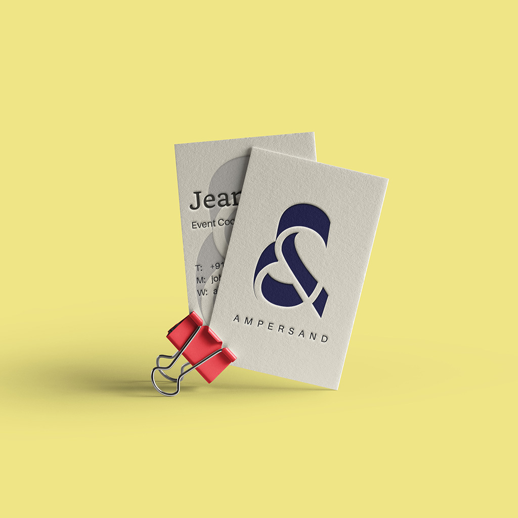

As creative professionals, we are night owls, albeit of a different kind. And naming the event company was our way of discovering the secrets of the other side of night. So we explored the many territories of the dark hour –seduction, allure, silence, whisper and magic. And then some. What did we realise? Whatever we thought the night could offer there was always something more that awaited us. Night time is therefore, a loop-de-loop of “and”. And the event company is a microcosm of all this and more. Hence the name – ampersand.
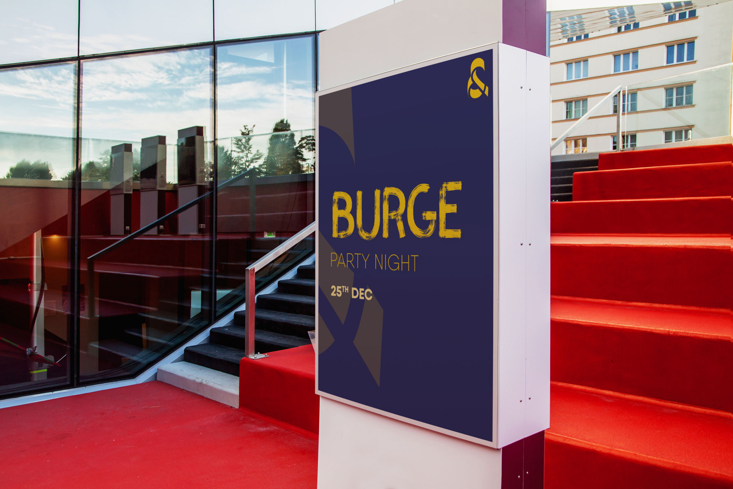

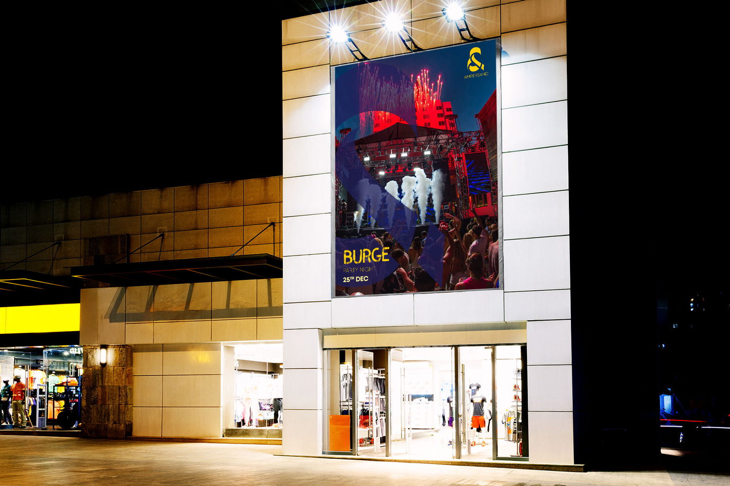
Visually speaking.
The design identity aimed at representing the discovered and undiscovered aspects of the night. Hence the stimulating use of negative and positive space and the projection of stability and movement at the same time. This look was inspired by and created for the young, who are always in search of more.